Your label,
ready for print.
From your first idea to a file that fits. Follow these five steps to get your artwork onto a can, with the right size and no guesswork.
Start with the right size.
Choose the can you’re ordering. Everything in this guide, from the dimensions to the downloads, then matches that size.
Create your file at
167 × 85 mm
Width × height · artwork only
For a sharp print
1972 × 1004 px
300 PPI · 3945 × 2008 px for the most detail
Keep important things inside
3 mm margin
Inside every edge of your file
The ingredients, nutrition and barcode panel is added for you. Don’t draw it or leave space for it in your artwork. What’s on it?
Choose a template for your 330 ml can.
Every version is 167 × 85 mm, with the same 3 mm safe margin. Choose the format that suits your editor.
PDF · vector template
For editors that can open a PDF. The text and guide lines are vector shapes, so this template has no fixed resolution.
Any photos you add still need enough pixels at their final print size.
Download PDFPNG · image template
For pixel-based editors. Choose the resolution before you start designing: 300 PPI prints sharp, 600 PPI keeps the finest detail.
3945 × 2008 px at 600 PPI
Download 600 PPI PNG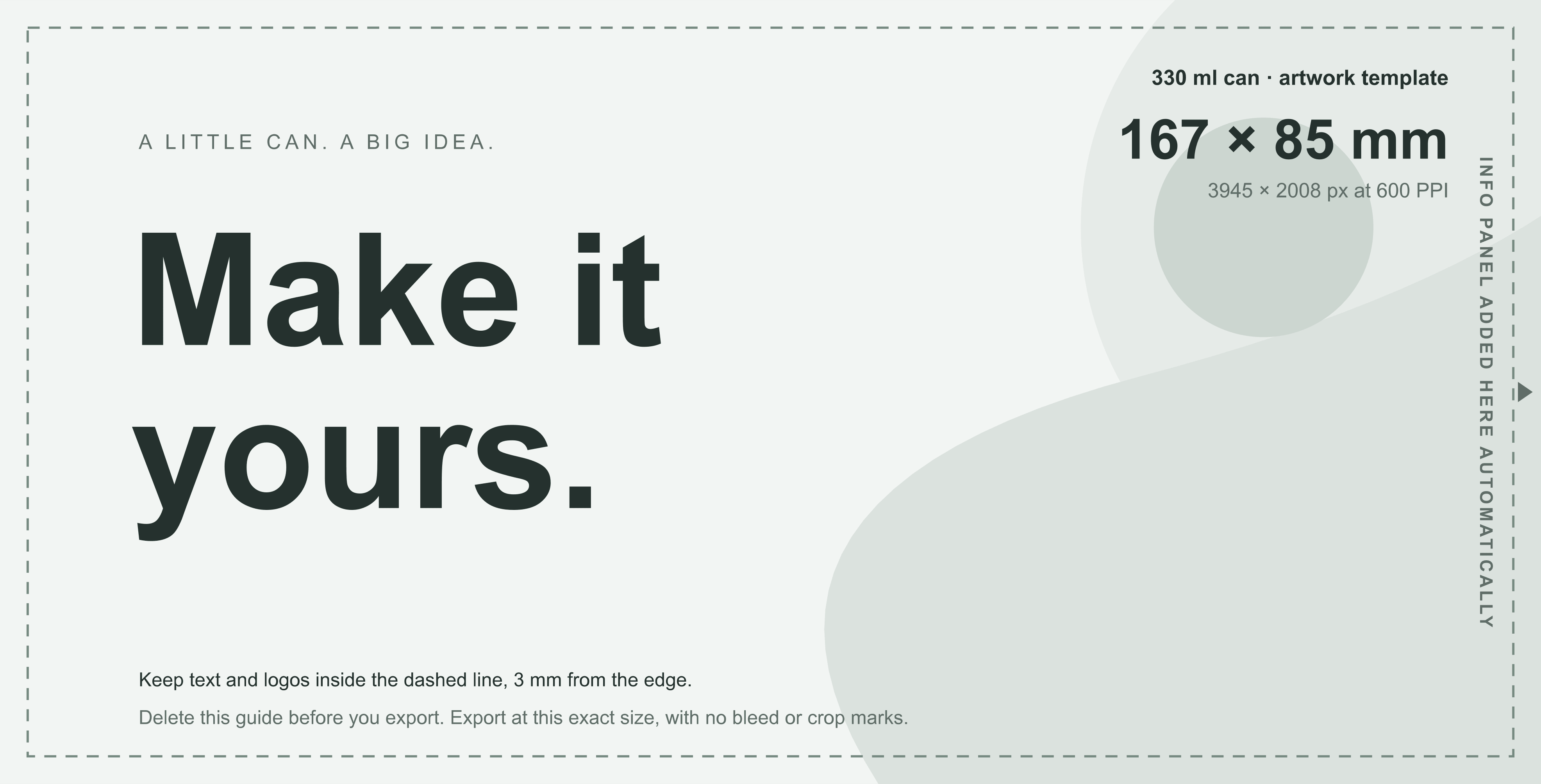
Each template shows a sample design, its exact size, the 3 mm line and where the info panel goes. Design over it, then delete the guide before you export. If your editor changes the canvas size, restore the millimetre or pixel dimensions shown here.
What does PPI mean?Give your design room to breathe.
A few things decide how your label looks on the can. Here they are up close, done right and done wrong.
Keep text 3 mm from the edge
Labels are cut to size, and the cut can shift by a fraction of a millimetre. Keep text, logos and QR codes at least 3 mm inside every edge.
Start from a sharp original
A small image stretched to label size prints soft and blocky. Use the original photo and a vector logo. Step 3 has the numbers.
Make small text big enough
Keep small text at 8 pt or larger, never below 6 pt, in a regular weight: very thin fonts break up in print. If you can read a 100% paper print, you can read the can.
The info panel
We add the info panel for you.
EU law sets out what every drink can has to show. We build the panel from your order details and print it to the right of your artwork, so it is always complete and correct. You don’t draw it or leave space for it.
- Drink name, ingredients and allergens
- Nutrition per 100 ml
- Best-before note, producer and origin
- Net volume with the ℮ mark
- Barcode, if your cans are sold in shops
- A QR code and the Made in EU or deposit mark
It isn’t a plain white box, either: the panel picks up the colours along the edges of your artwork and blends them across, so it flows into your design. Behind the text the colour is softened so it stays easy to read, and the barcode and QR code always sit on white so they scan.
On the order page you choose the panel’s language, whether it carries a barcode, and a deposit mark.
Want a panel that matches your design?
Add Design Assistance when you order and describe what you’d like in the Order Notes. Our designers build a custom panel into your label and check that it still meets EU labelling rules.
That’s also why we can’t print a panel drawn into your own file: the information on a can has to be correct and compliant, and checking it is our job.
Save a file we can work with.
Check the image detail first, then choose your export format.
Image quality, explained
Same label size. More image detail.
PPI means pixels per inch: how many of your image’s pixels fit into one inch of the printed label. More original pixels at the same physical size allow finer detail.
Some editors call it DPI (dots per inch). For your artwork, it means the same thing.
72 PPI
Low print quality
Will print blurry and pixelated. Text and edges will look rough.
473 × 241 px
For your full 330 ml artwork
150 PPI
Acceptable print quality
Your design is fine to print. Very small text and fine details get sharper with a higher resolution.
986 × 502 px
For your full 330 ml artwork
300 PPI
High print quality
Prints sharp. For very small text, thin lines or QR codes, a higher resolution is better.
1972 × 1004 px
For your full 330 ml artwork
600 PPI
Excellent print quality
Maximum detail. Sharp text, fine lines and photos.
3945 × 2008 px
For your full 330 ml artwork
Magnified illustration of the same 12 × 8 mm detail, not a print proof. Pixel dimensions are for the full 167 × 85 mm artwork. Actual quality depends on your original image and export.
600 PPI has 4× the pixels of 300.
Double the pixels across and double the pixels down means four times as many in total. The label’s millimetre size stays exactly the same. File size usually increases too.
Changing the PPI number won’t fix blur.
A small screenshot stays a small source, even if you type “600” into the resolution box or enlarge it. Start with the original photo or vector logo. Zooming into an image spreads its pixels further and lowers the effective PPI.
Choose your file format.
Recommended
For design tools & vector artwork
Export one page at the artwork size. Embed or outline fonts, and turn off crop marks and added bleed. Check the resolution of placed photos too: saving them as a PDF won’t add detail.
PNG
From Canva, Photopea…
For image-based designs
Export at 1972 × 1004 px (300 PPI) for a sharp print, or 3945 × 2008 px (600 PPI) for the finest detail. Keep your background in the file; transparent areas become white.
JPEG
For photos
For photo-heavy designs
Use at least 1972 × 1004 px and the highest quality setting. Avoid repeatedly saving and compressing the image.
SVG
From Figma, Inkscape…
For scalable graphics
Set the artwork dimensions in millimetres, outline your fonts and embed linked images so everything travels with the file.
Using Canva or another online editor?
- Create a custom canvas at 167 × 85 mm.
- Add your design. Keep important content 3 mm inside the edges.
- Choose a print-quality PDF export if available. Leave crop marks and added bleed off. If exporting an image, aim for 1972 × 1004 px or more.
- Open the exported file and check that it contains just your final artwork.
Colour, in two minutes
Screens glow. Ink doesn’t.
Very bright colours can’t be made with ink, so they print a little calmer. If your editor can, preview your design in CMYK before you export. If an exact brand colour matters, add its Pantone or CMYK reference to the Order Notes when you order.
100% black (K)
C0 M0 Y0 K100 · for text, thin lines and barcodes
Rich black
C60 M40 Y40 K100 · for large dark areas
Keep the total ink of any colour under 300%, so never C100 M100 Y100 K100. Working in Canva or another editor without CMYK settings? Skip this: we check ink levels in our review.
Upload it and place it.
This is what the order page does with your file, so nothing comes as a surprise.
1Upload. We fit it for you.
Drop in your file and it fills the label straight away. If its shape is different, the extra is trimmed from the edges. Nothing is stretched.
2Drag it into place.
Drag the artwork to move it. Open “Adjust” to resize it: pinch, scroll or pull a corner. It always covers the whole label and stops before the image would print soft.
3Single or split.
“Single” wraps one design around the can. “Split” repeats it on both halves, with the info panel in between, so a tall photo shows more. Upload a portrait image and we switch to it for you.
4Turn it, then order.
Drag the 3D can to check every side. After you order, our team reviews your design before it’s printed and gets in touch if anything needs a change.
One last look. Then you’re ready.
Tick these off as you check your file. Your design will also be reviewed before production.
Your pre-upload checklist
0 of 5 checkedSee your design come to life.
Upload your artwork in the order configurator.
This checklist is for your own review. It doesn’t upload, validate or submit your file.
We print the design you approve.
Before production our team reviews every design and gets in touch if something needs a change. Colours, fonts and layout are your call. There are only a few things we can’t print:
- Anything that breaks EU or Estonian law
- Logos, characters or artwork you don’t have the rights to use
- Your own ingredients list, nutrition table or barcode
- Files we can’t open, or far from the right size
- More than 300% total ink (we’ll suggest a fix)
When you need a little more detail
A few more answers.
Do I need to add bleed or crop marks?
No. Bleed is extra colour past the cut edge that hides tiny shifts when labels are cut. We add it for you from the edge of your file. Export at the exact artwork size, with no crop marks and no extra space around it.
My editor shows 72 DPI. Is my image too small?
Not necessarily. What counts is how many pixels the image has. Compare its pixel size with the numbers in step 3. Changing the DPI number in a file alone doesn’t add pixels or sharpen the image.
Can I design the info panel myself?
Not in your own file: we build the panel from your product details so it is complete and compliant. For a panel that matches your design, add Design Assistance when you order and describe it in the Order Notes. Our designers build it into your label within EU labelling rules.
What if I don’t have a finished design?
You can explore the templates in the order configurator or contact us for help preparing your artwork. Keep your original editable files so changes are easier to make.
A question about your artwork?
We’re here to help you get it right.